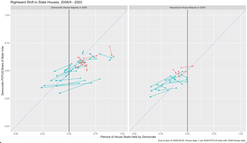
Not the prettiest graph, but was trying to get a sense of decline in Dem power at the state lege level over the past ~10yrs.
Simple story:
Dems lost majorities in 13 states, picked up 1
In places that kept D majorities, it shrank in 9/18
In places that kept R majorities, R maj shrank in 2/15
The 45deg line, w POTUS share on the y-axis, is intended to be a rough measure of over-representation.
A point below the 45 degree line = Dem share of house > Dem share of POTUS vote (pro-D house lean). Above is pro-R.
If an arrow is ~45deg itself, suggest no real shift in RELATIVE lean.
If we zoom in on the state w Dem majorities in 2009 and 2020, the picture (in terms of over-representation) is somewhat unclear.
Some states (the blue lines) seem to be turning more "balanced": share of Dems converging on share of POTUS vote. Red lines showing growing D power.
Split is 50/50.
A similarly-ambiguous picture does NOT emerge in those states that maintained GOP majorities in 2009 and 2020.
The long blue arrows that are fairly flat (slopes closer to 0 than 1) are states where the GOP expanded its house share far faster than the state itself drift right in POTUS elections.
Not a deep insight, but these graphs show the Dems and GOP are playing completely different games, in that the GOP is playing the game, and the Dems are, far too often (I see you, NYS Dems!) self-disarming.
Also, Dem share in House and Senate are pretty equal, so choice of House doesn't matter.
On a methodological note, I copied and cleaned all the NCLS data out of pdfs into csv's, if anyone ever wants access to it. Did 2009-2020. Made some abbreviations (treated vacant and unclaimed the same), but otherwise kept it as is.
Why, WHY [Kirk in Wrath of Kahn] WHHHHHHYYYYYYY....
... would you provide these files ONLY as pdfs? Why? They SCREAM "make me a .csv"!
I get why govt agencies do this. They do it BECAUSE they want to make it hard to use. But why do think tanks et al do this?
Why why WHY?
I feel like too often we classify states as "red," "blue," or "purple" based on their POTUS votes, but that seems ... mistaken ... to me for trying to understand any sort of state political outcomes.
(I mean, is GA "blue"? Or even "purple"? Not for 99% of things the lege does!)