Post

Avatar
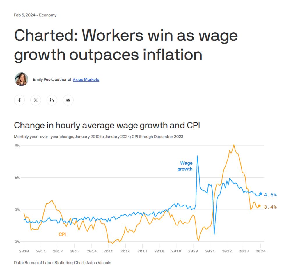
As a designer, I want to tell you why charts like this are bullshit. But it'd be a lengthy thread, and Bluesky hates threads, so I'm not sure if I'd be wasting my time.
Avatar
This is a topic I'd like to tackle in part of a larger project I'm not sure I'll ever finish, because it just seems too big for a mere citizen researcher like myself. But I'd also like to give people some tips on how to read charts, because if there's one thing I know, it's charts.
Avatar
Problem #1: When you see the line go down, you might think prices went down. But no, when the line goes down it only means growth as slowed, unless it goes negative. Contrary to popular belief, inflation *can* go negative. It's called "deflation," a word that terrifies executives and investors.
Avatar
Problem #2: In small text it says "monthly year-over-year change." This means each month's growth is compared to 12 months earlier, not the previous month. Except line graphs imply direct continuity, which makes this the stupidest fucking way to represent this information.
Avatar
Avatar
Problem #4: So why did wage growth go down in 2021? Likely the "monthly year-over-year" problem again. Things went so high that one month in 2020 that the corresponding month in 2021 goes down in comparison. What a garbage fucking chart.
Avatar
Some of these problems can be fixed by just making it cumulative (line only goes down for loss) and picking one month per year so the continuity matches. And you can see, it looks like workers (in blue) are still "winning." But that's because we're dealing with another problem...
Avatar
Great thread! Sorry I was too lazy to like all of the posts within.
Avatar
Avatar
Same reason AI is a scam. It's because correct inference is optional. The disease is cultural.