Thank you! I love it!
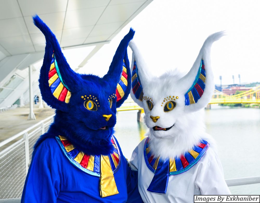
You're one of the very few to be able to get the exposure correct for that deep blue on Water, especially with being next to Snow. Usually it's oversaturated.
Glad you like it!
I had to bump the saturation on yellows though, because they came out rather faint. And I really wanted them to be every bit as bold and brilliant as the blues.
Here's two versions with the different yellow levels for easy comparison.
Upon reviewing, the original yellow actually looks okay, I think. Maybe it could be a little stronger, but maybe the latter is a bit too strong.
What do you think? Which one do ya like? :)
Tough decision. The one on the left is more color accurate. But that gold lame is pretty bold in person. Regardless, I just love seeing photos you took of us, because they're always awesome!