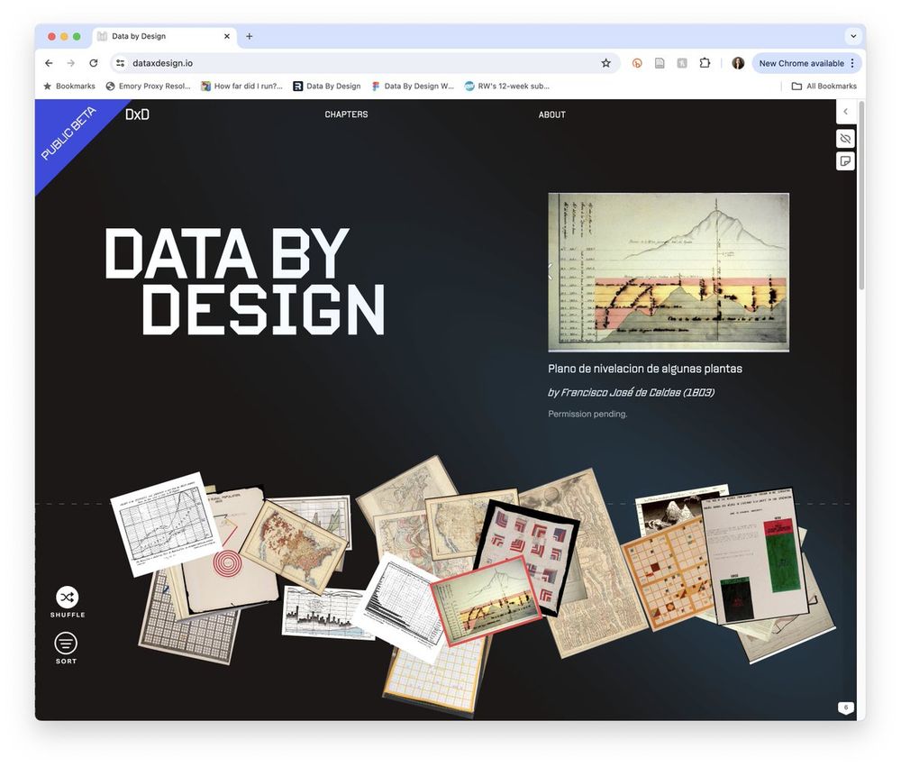
I am beyond thrilled to share that DATA BY DESIGN: AN INTERACTIVE HISTORY OF DATA VISUALIZATION, 1789-1900 is now open for community review at 💚 📊 dataxdesign.io 📊 💙. It's the work of 15+ people across 5 institutions, 2 continents, 2 babies, and a global pandemic. A 🧵 but first:
The rest of the team! This public beta was created by Tanvi Sharma, Jay Varner, Shiyao Li, Margy Adams, Nick Yang, Dan Jutan, Jianing Fu, Anna Mola, Serena Fang, Yang Li, and Silas Munro. Qing Tian, Adam Hayward, and Morgan Orangi contributed to the original prototype 2/
DxD is a counterhistory in the full sense of that term. It retells the history of data visualization alongside the histories of colonialism and slavery. In the process, it shows how questions of ethics and justice have been present in the field since its start 3/
The intro proposes that the history of data visualization is composed of an infinite number of stories. Drawing from my favorite Benjamins, Walter and @ruha9.bsky.social, I explain how, by looking at any two stories together, we gain a more complete picture of all 4/ dataxdesign.io/chapters/intro
Chapter One employs the indelible image, "Description of a Slave Ship," from 1789, to establish the tremendous power of data visualization and the responsibility that comes along with it 5/ dataxdesign.io/chapters/des...
We also describe our own attempt to re-visualize the data of slavery with these lessons of power and responsibility in mind. We layer in the thinking of Jessica Marie Johnson, Romi Morrison, and Kevin Quashie to explore the uses and limits of visualizing resistance 6/ dataxdesign.io/chapters/des...
Ch 2 centers on the import-export charts of William Playfair, who is often viewed as the "father" of data visualization. Here we show how Playfair's images, far from being neutral or objective, were also designed for a particular audience and purpose 7/ dataxdesign.io/chapters/pla...
interesting. I'd love to explore more but my connection is rather slow.
Also on scrolling the intro page [screenshot]. I guess this is a known issue.
#dataviz#infoviz