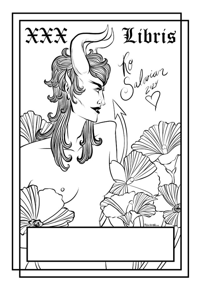
I feel like the black and white is lacking the contrast that the color version gets, which makes it less easy to read. I think it would benefit from more contrast and shading to make it pop in it's own way.
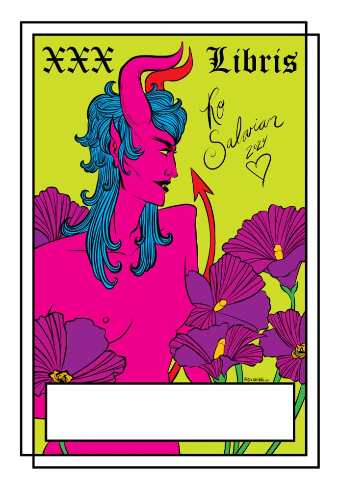
I think the colour version is more eye catching and immediately makes me think "oh I know this art style". The BW is lovely but the colour version is more to my liking