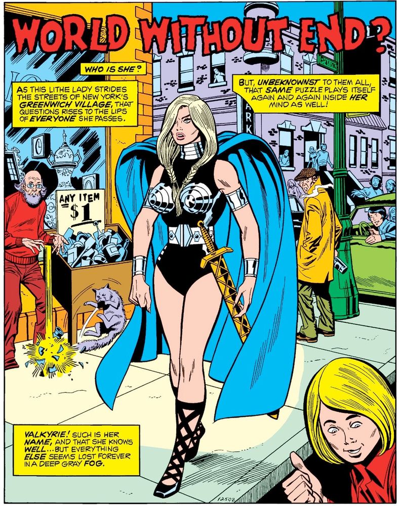
When Sal Buscema took his time, which was about once a year, he could draw a really sweet splash page. This is one of my favorites. Defenders #5, 1973. One of the best drawings of Val. Lots of detail (for Sal), nice perspective.
Sal, for better or worse, was THE Marvel house style in the 1970s. Dude cranked out 3 books a month! Of course, they were all stock poses and the same 5 facial expressions, but hey they were easy to read.
Makes Kirby's output in the 1960s even more astounding, because Jack never relied on formula.
Valkyrie and her metal bra was designed by brother John Buscema, of course, for one of Roy Thomas' funniest rightwing WTF tales, the anti-feminist screed, The Lady Liberators.
Where would Marvel have been without the Buscema Brothers? Between them they drew like a quarter of the monthly catalog!
Sal's Subby run in 1970 might be his best work. Very overlooked.
In the late 1980s, I read "Spectacular Spider-Man" instead of "Amazing Spider-Man" because I was far more attracted to Sal Buscema's art style than Todd McFarlane's. Even now, my iconic image of Spider-Man is Sal Buscema mixed with John Romita Sr.
I love Sal. Few cartoonists can be as kinetic and not even John can match the movement in the panels.
That said, I always wonder what's holding the cape up. Like the drapery is suspect.
Steve Englehart was a terrific young writer. All of 25 when he started on Defenders.
And Steve Gerber took over Defenders and that was just bonkers fun.
I offloaded my run (bought off the rack in the 1970s!) years ago. Wouldn't mind reading it again. Oh well.