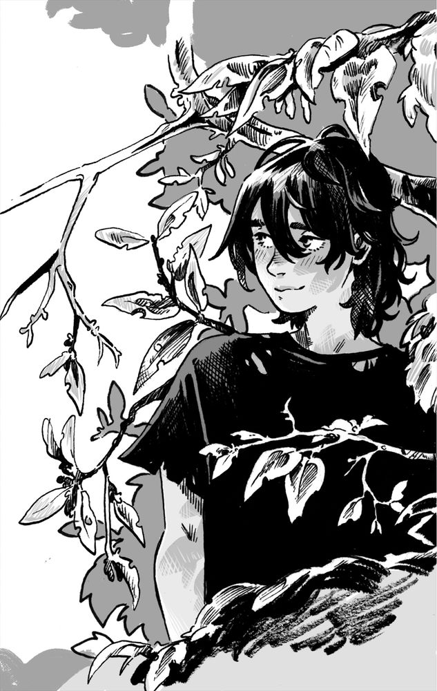
Hey quick question, whats your opinion of my grayscale? Its simple but thats intentional. I want to focus most of the time per page on inks. Im just curious how it feels since it’s hard to gauge on my own sometimes haha
I really like that you hatched some of the fade-outs, it makes the grays way more integrated w the inks! And I think leaving it at midtones/light is smart for keeping the focus as well. Tbh my biggest opinion is you should keep playing w it bc it rocks/you can do so much fun lighting stuff
It looks really great!
One thing I'm figuring out is that I probably over-toned Pathways, and having studied some of the more current stuff (esp given I'm one person) less really is more, and I need to not forget that XD ESPECIALLY if your lines are fantastic like yours, you can do a lot with that
Haha i get that. I recommend getting some physical screentones and trying them out. They’re really hard to do complex shading with so it kind of forces you to think in big shading blocks
I did some back in the day, but yes, absolutely. Honestly, just looking through dungeon meshi it's all "I have been doing TOO MUCH on the parts I hate the MOST and could do more BELOVED INKING INSTEAD" LOL XD
I personally like it because it's "simple" (looking at it ofc), natural, clean and doesn't take a punch on the eye like many other artist instead do when colors isn't present; I could easily read 300 pages like this without removing my eyes from it.
I like it.
This might be my own personal preference, but I feel like some light texture on the gray flats would make it feel more unified, if that makes sense.
I totally agree with that. I normally have a basic texture i put over my greyscale but i found recently that it looks awful in cmyk so i need to find something else haha
I think your greys work well with your lines! The grey is simple but accentuates the texture in your linework. And the hatching in the grey ties in well with your hatching in your lines so it doesnt feel flat (i often have the problem of flat looking grey tones when i try to tone..)
It's gorgeous! Good proportion between the white, grey, and black planes, as well as variation within those areas. It's easily readable but still nicely detailed.
even though it's not heavy with tones it has the same feel to me as toned manga art?? like there's a certain quality of depth and texture that i feel manga tends to have that you're accurately translating with ur grayscale work. i rly hope that makes sense LOL
it's nice! I like the 4 level white/light grey/dark grey/black that you get with it, and it mimics screentone approach while still rendering properly on a screen. If you can find some way to add a bit of textured bite to it without ruining its printability that would be a bonus but I like it.