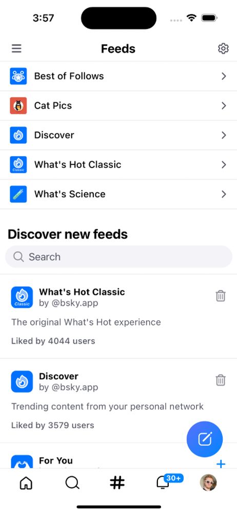
📢 Version 1.51 has a bunch of big updates!
• The icon for the feeds tab is now a hashtag, and the tab lists saved feeds and suggests new feeds.
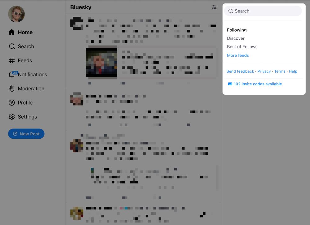
• On Web desktop, your pinned feeds are now in the right sidebar.
(We're working on hashtags too, so consider this a teaser!)
📢 1.51 (cont.)
• Opt-in experimental feature #1 🧪: Weave posts from saved feeds into your follows by toggling on Settings > Home Feed Preferences > Show Posts From My Feeds. Let us know what you think!
📢 1.51 (cont.)
• Only show replies from people you follow by toggling on Settings > Home Feed Preferences > Reply Filters > Followed Users Only.
• Control the sort order of replies via Settings > Thread Preferences: oldest, newest, most-liked, or random!
📢 1.51 (cont.)
• Opt-in experimental feature #2 🧪: Improve readability of threads by toggling on Settings > Thread Preferences > Threaded Mode. Send us your feedback on this!
📢 1.51 (cont.)
General Updates:
• After following a user, you will now get some additional suggested follows.
• User display names can no longer move around in the UI by using RTL control codes.
• Post controls (like, repost, etc) should now be easier to tap.
📢 1.51 (cont.)
• Some improvements to the language settings.
• Some accessibility improvements.
• Some improvements to the image viewer zoom behaviors.
• Middle clicking on web *should* work now to open posts.
• Fixed an issue where some browsers failed to save your birthday.
I am still unable to save my Birthday on IOS. The option to save the it doesn’t show up at all, regardless if I use light mode or dark mode. I only have the scroll wheels for the month, day, and year, but no “save” option.
For me, middle clicking on a post still gives me a scroll option. I need to middle click on the username for it to work. I don't know if this is how it's meant to work, but I'm on Windows 10
can you see about when you put the pointer curser on the name of the person their Bio and follower information pops up in a small window without clicking on the name opening up that user whole page, it's like that on X
It's good, but y'all need to get away from the old Twitter design and use more of the screen space. Also don't indent OP self-replies or the whole threads piles right for no good reason.
Thread folding, yes! But for the layout of the old Twitter, to be very honest, it feels more like something "we all used to know". Imho, if you fill like 90% or something of the full width, it'd be just too much and too massive 🤔
this is what i was just gonna say - it feels unnecessarily cluttered and claustrophobic like this and i'm heading to disable the setting right now because of it.
can you imagine if fanfic writers tried to write threadfics here like they do on twt with this indenting method lmao 😭
I'm loving threaded mode, but could we have a setting for how many levels deep it can go?
Most times, one or two levels are enough for me unless I see a particularly interesting sub-thread. And even then I can click the thread to dive in.
Also, maybe replies by the original poster should not moved to the right (as shown in the screenshot).
After all they're not really replies, they're more like continuations. They're even labelled "continuation" in your post.
Threaded mode is interesting for the discussion under a post, but very bad for a thread. I think this will work better if there’s no indentation when successive posts are from the same account
Love threaded replies, would love them more if they had an option to maybe only show five or so posts in that reply thread, with a Continue option so we don't have to scroll aaaaall the way down to see the 2nd reply when the 1st reply has a lot of traffic on it.
As others have said, please make it so replies from the same user do not thread right and this is basically perfect. Also agree with the sentiment that a 'wide mode' would be pretty fly too