Post
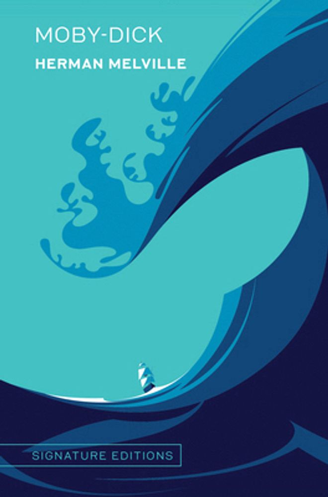
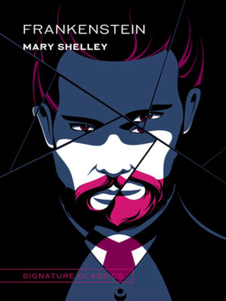
These covers are just so wrong. 🐋 🔩
I kinda like them. The giant wave doesn’t scream Frankenstein but it looks cool.
IMO
I think they both look kind of cool, but they don’t match the book. Moby Dick should have a whale, not a wave, and the Frankenstein cover would make more sense for something like “Dr. Jekyll and Mr. Hyde”
I see a whale in the shape of the wave...but it isn't a sperm whale. I guess it could be one of the other whale species.
I can kind of see that, but it’s too subtle for me.
Maybe it's because I'm looking at it on a small screen, but the "whale" is all I saw until my eye caught the boat.
And I didn’t notice the boat until I read this.
Yeah, I saw a whale and had to look twice to see the wave.
Huh. Maybe the whale is more noticeable in the cropped image that Bluesky shows?