I kinda wish they would have just slid the purple O into the yellow stripe that was already there.
It would have made more sense, made it easy to update existing flags with a bit of paint or a marker, and made it look less cluttered.
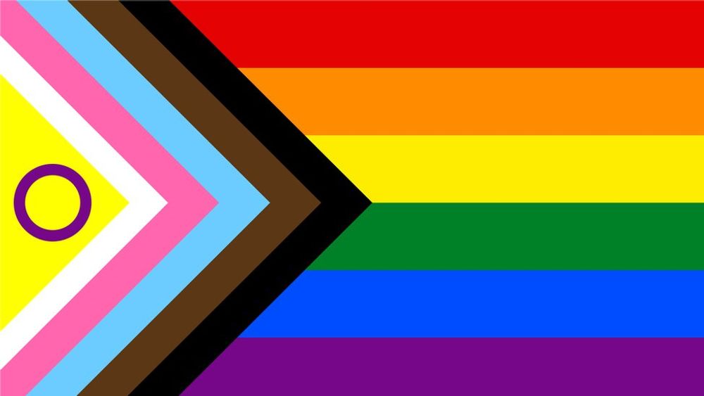
As a quick example:
Also, looking at this, I think it's the proportions I like the most. Each horizontal stripe is about 2 inches and the chevrons are about an inch. It flows well together and is easy to see.
The other flag the yellow triangle is just dummy thiiicccc, and throws off the flow.
Hmm, what about a two tone slash on the yellow then. A 90 degree angle about half way down that converts into the darker yellow, but I like your circle idea. It fits better.
Here's some mockups. I like all 3, but the 3rd is my fav because it looks like a stargate symbol.
I like the first. The gold and deep purple is too much of a contrast to the pastels of the trans flag, and I'm not thrilled about the rainbow getting slowly squeezed for space.
It represents everything we strive to be. The new additions are reminders that we need to work harder to be that...
I assume the other symbolism got added because there were people for whom the Pride flag still represented gay sexuality, which was its original intent after all.
I feel you, it’s a subtle distinction but I think it gets missed by some that it’s not about including the chevroned groups, but emphasizing their importance…
In heraldry a chevron represents the Base of the house and signifies protection
the white line is thinner and that pisses me off, and i think the circle could be centered better but otherwise i like it, especially vertical.
also, the incredibles ohio flag meme was pretty good, so i like it for that reason too.
this is the maximum amount of information I think a flag should ever try to convey, unless it would annoy conservatives if the flag had even more on it
Oh it's a vexillologists sleep paralysis demon, but as long as it continues making conservatives angry, it could be as aesthetically nightmarish as it wants to.