One of the things about the classic DC bullet was that it not only looked great on it own, but it was designed to be cropped, to be positioned in a way that it bled off the corner of the covers.
I don't know how Milton Glaser came up with that, but I can't recall another logo that did the same...
...and it anchors the bullet, logo and other trade dress in a really effective way. DC's other circular logos often look good on their own but don't have this particular strength.
It was a good logo.
There were other times it was used fully, and it looked great then, too. Different angle of rotation here, though. I wonder if Glaser intended that, too.
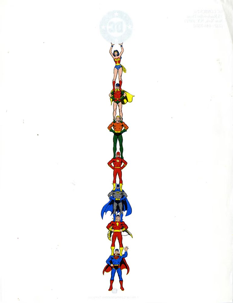
I also loved this DC letterhead design, also by Glaser. This is the back of it, so the heroes showed through the paper on the front, where the bullet was of course solid.
Echoing what others have said. While I don't know crap about marketing and such I feel the bullet was such a perfect icon it's hard for me to believe they just ditched it. I'm sure there were reasons, but that will always be the icon of DC to me.
If I'm remembering correctly, when they changed it they said they needed a logo that could be animated, for movie/TV use.
I don't know if that was the whole story, but I can see easy ways to animate the Glaser bullet, so ¯\_(ツ)_/¯.
They could have just had the DC part straight and turned it to it's normal position. Animated, focuses your attention to the company initials (and what 99% of the people call the company) and ends with the logo that you want them all familiar with. Problem solved.
I can't remember where I read—in the past month, even!—that the tilted-bullet logo was not Glaser's #1 preference of the logos he submitted. (Will check back if I recall the source or details.)
Note that the heroes here are reversed -- Robin's R is on the wrong side, Superman's S is flopped, etc. They're meant to be seen faintly through the front side.
I think the heroes here are stacked theoretically in order of sturdiness (with Wonder Woman up top because it would be rude to stand on a lady), but if so, Aquaman should really be between Captain Marvel and Batman, I'd think.
Poor Arthur’s the Rodney Dangerfield of heroes. One of their most iconic characters yet is oft not published. Hope someday we get to see more of your Aqua ideas.
Bruce's shoulders really hate the lineup. "It's (erk) okay. I'm BATMAN! I (hrrrk) don't know the meaning of pain. (oh god my lumbar discs.)". it's not like he has a severe back injury or anything.
No idea. This is something where I am more interested than knowledgable. The earliest example I have (of a mere two, one I cannot find) is from 1984 and has that JLA-plus-Big Red Cheese image you show.
I’m getting flashbacks of the rejection letters I got in the 80s that were on this paper. As a teenager I had a pipe dream of being a comic-book writer, and sent DC a bunch of terrible scripts. (Though Dick Giordano did scribble a supportive handwritten note on one of them.)
I don’t know what that means. He was his world’s mightiest mortal and considered an equal to Superman. Also, I believe, a profitable licensing character, who had had his own TV series in recent memory.